Contact Us
American Players Theatre
5950 Golf Course Road
P.O. Box 819
Spring Green, WI 53588
(Map)
Box Office: 608-588-2361
Administration: 608-588-7401
Fax: 608-588-7085
American Players Theatre
5950 Golf Course Road
P.O. Box 819
Spring Green, WI 53588
(Map)
Box Office: 608-588-2361
Administration: 608-588-7401
Fax: 608-588-7085
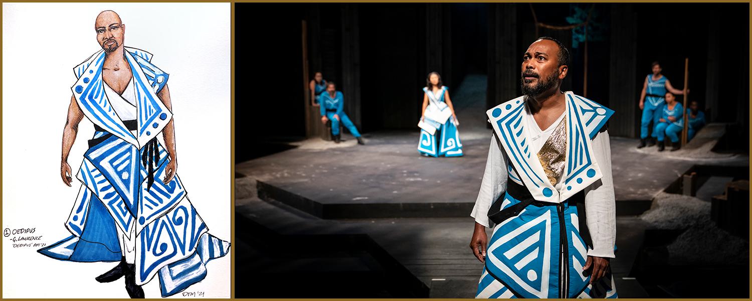
Whether you've seen the play, or the production photos, or you're seeing it all right now in real time, there is no denying that the Oedipus costumes are stunning works of art. We've received so many questions and compliments, we went to costume designer Daniele Tyler Mathews for the answers.
Image: Daniele Tyler Mathews' costume rendering, and Gavin Lawrence (foreground) in the sleeved, cold-plan costume.
Can you talk a little about the Oedipus design process?
Daniele Tyler Mathews: You know, a lot of plays have more of what we call “given circumstance” - parameters on the play like time and place and setting and mood. And the Greek plays have really high stakes, but they don't have a lot dictating the aesthetic. So I was really excited to be asked to design this play, because I had never designed a Greek play before, but also because, in the Greek plays, everything is so high stakes - literally life and death. And you can go very bold. Looking at the rest of the season, this is really the only opportunity that APT had to truly do something outside of their wheelhouse, conceptually. All the other shows, even the Shakespeare to some extent, had more parameters. So that’s another reason we decided to go as bold as we did.
I've never worked with DD [Core Company Actor, and Oedipus Adaptor and Director, David Daniel] as a director, but I've worked with him as an actor many, many times. And he is a very brave actor who is not afraid to make bold choices. So it was really fun to work with him, because he was not afraid to let me push the aesthetic boundary to the limit, and beyond what APT has done before. He really wanted it to feel like an ensemble piece, especially with what we were doing with the chorus and the named characters as shared roles, which is not typical in Greek theater. And I think this adaptation of the play is stronger because there are eight actors who play all the named characters, and also play the chorus. I think it really serves the narrative well, and it really serves the play well. But we needed the characters to have a cohesive look.
And we gravitated towards monochromatic as a color palette from the beginning. Color is a very strong design element to use, and people put a lot of personal subjective meaning behind color. When you take colors out of the design, and use a monochrome palette, you’re taking color out of the conversation in terms of, for example, assigning a color to a character, or assigning a color to an emotional state. In the first iteration, the palette was all gray. And it was very drapey and very close to the body. And we moved away from that because it didn't feel bold enough. But we stuck with the monochrome because we wanted to make everybody feel like a unit, and use other design elements to distinguish between characters. To use design elements they could put on when they stepped out of the wall of the chorus, and into their own named characters, and then back. So with the blue, I was trying to create something bold that also further behaved in the same way that the performance is going to behave; to support that directorial idea.
How did you choose that particular shade of blue?
DTM: Yeah, why the blue? I kind of don't want to say, because I’ve been hearing some really great theories from people about why they think we chose the blue, and I don't want to shatter anyone’s personal concepts of what that blue means. But one thing I will say is, in color theory, if you think of color as a wavelength, blue has the lowest wavelength, while still exciting the retina. The blue is a bold, bold blue, but it’s also more neutral and relaxing than, for example, a bright red. So because of the way the color works, your eyes won’t get tired of looking at that blue, even though it’s a vibrant color. That was also part of that conversation. Sometimes when you design, you kind of have to design through your reptile brain. And your gut; just go with what your gut tells you and not question it.
I also want to say that we didn't buy all of those clothes and all that fabric in the same shade of blue. Our painter/dyer, Samantha Fromm Haddow, she worked very hard to make all the pants and all the tops that exact same shade of blue. And the day that I came into the costume studio and saw her work, I was like, I don't know how you did this, but it's amazing. She also did all of the painting on the costumes in the show. Her artistry really makes the design work well. Oedipus would not be the show that it is without her the hard work.
How was working on Oedipus different from other shows you’ve worked on at APT?
DTM: I think this show kind of feels like a collection. In the beginning, DD said ‘I want people to come to the show and think, that is so cool. I want to wear that. Or that is so cool, I've never seen clothes quite like that.’ He really wanted that reaction. And I love it when the director tells me reaction they want to elicit from the audience, because then I can reverse engineer it. I know how to get that reaction from somebody. So that was fun, and I like doing that, and it allowed us to be really bold with the art of the costumes, but not in a way that it feels like the costumes are wearing the actors. I think they are visually arresting while still letting the performer really shine. And there are some very long sections of dialogue in that play, so I thought it was nice to give the audience a beautiful thing to look at and appreciate for a while, while they were taking those lines in.
How did you choose the design elements for the named characters to differentiate them from the chorus?
DTM: All of the gold elements are made by Michael (Hansen) our milliner, in his shop. And they're all real metal. I hadn’t included them in the original designs, and at first dress, the costumes felt like a bit like a runway collection. And I felt like it needed something to make the characters feel distinct. So I added gold elements that were kind of worked like monopoly pieces - unique to each character in a way that is, hopefully, iconic to the person. Like, Creon is all about strength, and that’s reflected through the gold bands on his arms. And Jocasta has that beautiful, architectural brooch, which kind of blends into the costume. And then we added some small details, like a bold dash across a certain part of the costume or the actor, so that we could capture something unique about each character.
Was there a particular moment in the process that sticks with you, that you really loved?
DTM: There are two that I can think of. One is that, one of my favorite things about being at designer is really collaborating with other people. So the way we do costumes is often we’ll do a mock-up, so we can then start taking in the fabric, which we call a fabric fitting. And then there's usually a second and sometimes a third fitting after that, to focus on the tone and details and fit, and things like that. Generally solve problems and learn more about how things look and move. And we needed a mock-up of a costume Gavin had been using in rehearsal, so that when he came to the first fabric fitting, he had been using that long train already and getting a feel for it. So during the fitting, Gavin was walking around, and he already really knew how to work the train, because he’d been rehearsing with it. And then by the time I went to the designer run, he was using that train to create punctuation to his words, and to his lines. And I really appreciated that he not only embraced the design, but found a way to use the design elements to enhance his performance. A lot of people would look at like a 2-foot train and say, ‘Oh my gosh, what a burden.’ But he really uses it to tell a story.
The second is the whole process of working in the shop. It’s really my favorite thing. So the drawings for this show are pretty intimidating. And the Draper, Emily [Bustamante], she really worked at every step, every day. And I came by the shop, and you never know what the costumes are going to look like in person. I was just completely thrilled by her interpretation of what I drew. And conversely, the way the design was painted - I was like, I'm so glad you did this, because I thought I was being very precious when I was doing the rendering, and I was a little worried about how it was going to translate. But she really massaged the designs to be elegant and beautiful. And I love those kinds of collaborations with people.
Can you talk a little bit about what it’s like designing costumes for the Hill Theatre?
DTM: I’ve worked at APT for a number of years, first as an assistant designer, and then a designer. And I almost always work on the Hill. So I’m very familiar with the challenges up there, and that we design for weather. Everything will get wet, and pieces will be dragged through mulch and up and down the aisles. The shop is very good at engineering around that. So when I design on the Hill I always think about, well, this might play in 95 degree weather, and then it might play in like 40 degree weather. And a lot of people may not know this, but to prevent the actors from slipping, the surface of our stage is basically like a heavy grip sandpaper. So you also have to think of something like the train in Oedipus, and how it’s going hold up to essentially running across a belt sander for two hours.
Also, the Oedipus scenic design uses gravel, which kind of scatters across the stage as the actors move. So when I was designing this show, I was like everyone is going to be in hiking boots and joggers. Because joggers are very easy to move in, but they're also very forgiving in hiding practical elements like knee pads - which we need, because some of the actors kneel, and one piece of gravel in the wrong place can do serious damage to an actor's knee. So we have to plan for that – it’s a combination of practical design elements and creative costuming. And, you know, being on the Hill when that thing happens – when all the elements align, and the weather is perfect. Or, like in the last dress of Oedipus, the wind picked up, and it would blow through the trees at these perfect, poignant moments. That’s just really magical, how the weather and nature can be another character in the play.
Anything else you want to add that we haven’t touched on?
DTM: I would just like to say that I really appreciate that APT understands, at its core, that along with heightened language, design elements are very important to telling story. The shows live in the design elements, and if we don't invest in the process, we're not going to get a worthwhile product. The thing about working at APT is that they really understand that design elements matter, and the people who create them matter. The people, and the process – that’s why am I here.